Showing posts with label district 5. Show all posts

Tuesday, November 23, 2010

White Rabbit

Tenant: White Rabbit
Tenant’s profile: Advertising agency
Office Building: Madách Trade Center
Size: 300 m2
Number of employees: 17


During our visit to see White Rabbit, our first surprise came when we entered the elevator. At the reception area, we saw that the company occupies floors 11-12., but in the elevator the floors were only numbered till the 10th. Thus began our chase of the illusive white rabbit in the sky, in the office building by Madách tér. Two right turns, end of the long hall, a glass door opens onto nothing. We step out the door.
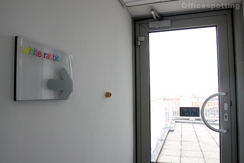
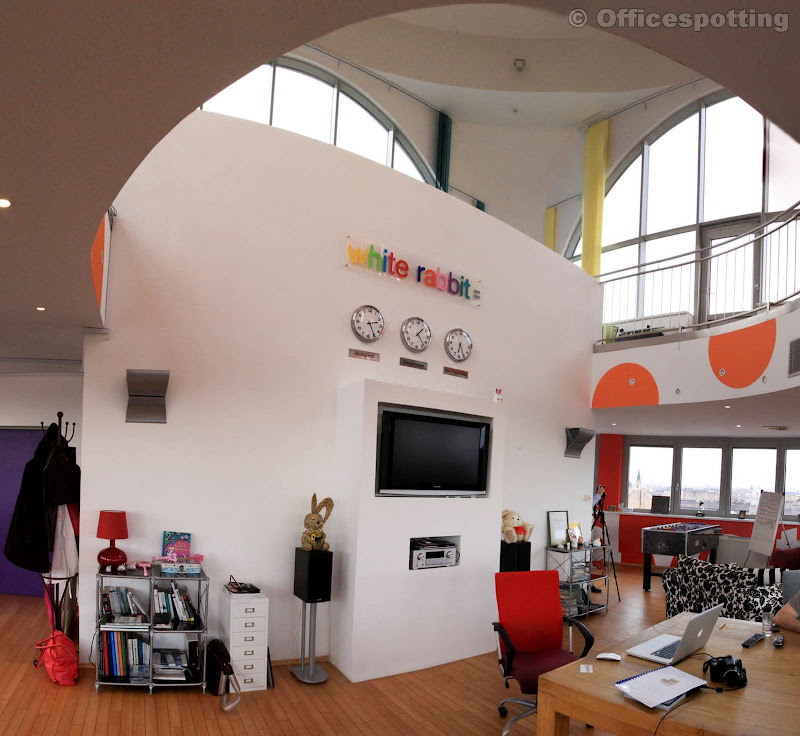

Just before stepping into White Rabbit’s office, one finds oneself on top of the city, with no roof or window to disturb the view. There is no shortage of adventure when going to visit the white rabbit in his lair, and each adventure only heightens our curiousity. An office, here?


I’m not sure if the storylike words above give any hint, but by entering the building are in an extension of the office building below, in a 15 meter diameter round shaped tower. Windows in every direction. The only tenant here is White Rabbit.


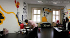
As we step in, the managing director immediately jumps up from a meeting with his colleagues to greet us, and readily invites us in. I believe we have arrived in Wonderland. All around are colorfully painted walls, an abundance of rabbits, storybooks, black-and-white sofas. Above us, another level and a dome. Everything fits together wonderfully.

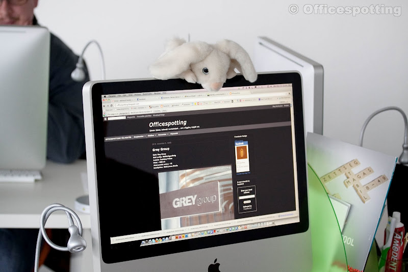

White Rabbit was established in 2006 by 4 advertising professionals, who have been running the company ever since. The company is a full service advertising company, which means they do most everything in-house. It was two years ago that they moved out of their original office, in a flat, and found this fantastic space. As Levente Bálint says, they are quite proud of their office, and endeavor to enchant as many clients with it as possible. 


To give you an idea of what happens when we visit an office: usually we are first shown around, so we will know what to expect, then we are allowed to roam freely through the areas, to photograph whatever we feel you should see. Meanwhile, we have the opportunity to observe the employees working in the office around us. What made this advertising agency exceptional, is that all throughout the time we were there, the air was simply buzzing; with brainstorming sessions and the constant hum of creators in action. No one was buried deep in their computer, or was doing things in a mediocre tempo, as is often the case. The pace is rapid this version of Wonderland.


The distribution of the three floors is as follows: art directors, writers and creatives sit on the top, managers and owners on the middle level, and client relationship managers and graphic designers on the lower level. All told, l7 people work in the 300 square meter office. The bottom floor was a recent addition to the space, and is somewhat more secluded than the other two. 


During our visit, the weather was overcast, but it’s not hard to imagine the office during sparkling sunshine, when working on your computer is near impossible. Perhaps the air conditioners are up to the task, but the shades probably are in a much tougher situation. Hence, even in such a beautiful 360 degree panorama office space a dilemma arises: you won’t be able to see much if you have to close the drapes to be able to work.
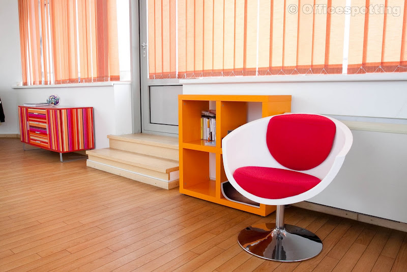

As can be seen in the introduction, the company’s name, it’s profile and the office all suite each other perfectly. Thankfully for them, they lease enough space for expansion, nonetheless I won’t envy White Rabbit if in the future, due to the number of employees, they have to leave this place.

További képek:

Monday, November 8, 2010

ReVISION

Tenant: ReVISION
Tenant’s profile: Advertising agency
Building: Szép utca 4.


We arrived at ReVISION’s office with great expectations, as we were expecting quite a bit from one of the top domestic guerilla marketing company’s office. We were not disappointed. 


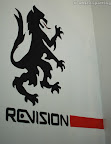
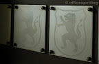
The enormous wooden door is festooned with hundreds of small metal plates, each of which depicts a lion figure. As we opened the door it became apparent that it is in fact the ReVISION logo that appears on the door, but as we were told the small metal logos were left there by the previous tenant. As they put it, they didn’t find their office, their office found them.


For starters, we are taken down to the cellar, where they proudly show us their future meeting room door. In the past, the building housed a bank, and it seems logical to use it’s old vault as a meeting room. I trust this was well thought out, as I certainly wouldn’t want to be in the client’s shoes who is asked to be patient for 5 minutes while the some last minutes items are discussed, perhaps coupled with the door being closed for the duration.


The company was established in 2005, and it was in 2007 that the workload became intense. As is the case with many other creative companies, they also started out by going to coffeehouses to brainstorm, outside of their regular jobs. Later on, due to the volume of new clients, they each left their jobs to build the brand with full force. By now they offer multiple services under the VISIONED brand name. 


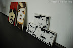
The Szép utca office is not nearly completed yet. Quite a few pictures are awaiting their final locations on the walls, but you can tell the guys concentrate their creativity mainly on their clients as opposed to interior decoration. Regardless, the pictures patiently await their turn on the wall and – let’s be honest – it is quite fitting for a creative agency to have their pictures lines up on the ground against the wall. 


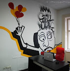
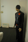
The basic concept was for the employees not to have to stare at white walls at work, and so they asked a graffiti artist from Pécs called Zina to bring some yellow and black paint, and create a more lively atmosphere. He then took a projector, projected some of his art onto the walls, and commenced to paint over them.


The remainder of the office is a collection of works done for clients. They are especially proud of the Vámház krt. 9 sign in the hall, which was apparently the original one held by Klapka in the commercial. 


We will probably revisit the office in a few months, as we are curious to see how the final state is going to look like.

Additional photos:

Sunday, October 17, 2010

Tópark

Tenant: Tópark Sales
Tenant profile: Real estate leasing
Office building: Roosevelt 7/8
Interior design: Tópark Designer team


 Yet again, we visited the Roosevelt 7/8 office building, and yet again we found ourselves in a somewhat unusual office space. Not many are unfamiliar with the Tópark name – or at least in the capital, thanks to the extensive marketing seen over the past years. Now we introduce you to the Tópark Information Center.


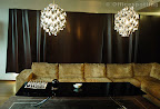
 The office was created in a part of the building originally intended for retail use, facing Roosevelt Square, which comes as no surprise as the purpose of the office is sales. Comfortable sofas, elegant installations, soothing dim lights and sales brochures everywhere – one feels as though being in a high-end travel agency – except here the trips last for years, and the destination is adjacent the Törökbálint lake.


The entire space is dominated by a scale-model exhibit, displaying all phases of the Tópark complex. Buttons operate the lighting of each individual phase, thus putting into perspective the true dimensions and final state of the project. Beside the model is another one as well, which reaches across almost the entire length of the office, and presents the viewer with the facade of the project and the daily life of Tópark residents.


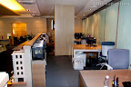
 Workstations are located along the back wall of the area; this is where the leasing team makes their phone calls and writes their proposals. There are not many personal items on the tables, suggesting that here work is the primary concern (although there is a golf kit hidden between the filing cabinets, ready to go in the event of good weather).


The main peculiarity of the office is the above mentioned scale-model and purple coloring, but those working here did mention a tendency of tourists and passersby coming inside for lunch or a cup of coffee. The surroundings do give one a lounge type feeling, as the table- and groundlamps, sofas and tables imported from Italy give the place a modern and clean tone. All in all, by visiting the Tópark Information Center we had the chance to discover a high quality and extremely well positioned sales office.


Additional photos:


Tuesday, September 28, 2010

Dr. Rose

Tenant: Dr. Rose


Tenant’s profile: Private Hospital
Office building: Roosevelt 7/8
Interior designer: Mauricio Flores


I’m sure many of you will wonder what we are doing showing you a private hospital on an office blog. Perhaps the best reason is that this hospital is located in an office building, and the pictures you will see illustrate what solutions can be achieved even a run-of-the-mill office area, inasmuch as one spends the appropriate amount of time and – as you will see from the photos – money.


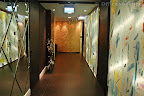
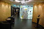
The furnishings at Dr. Rose’s hospital are all about showing the arriving clients that here they are in a safe environment. The brown color theme, the dimly lit surroundings, the paintings on the wall all strive to make sure the patient can relax.


On the spot where back in the day 5 year plans were approved, then calculations were made for achieving 120% efficiency, patients now scurry to a fro. We were inside the Roosevelt 7/8 office building, which was built on the site of one-time National Planning Office – better known as the ’Spinach-House’, due to its color. During the planning stages, there was no shortage of city planning and zoning arguments, but I think everyone can agree that this new building is better than what was there before.


The hospital is situated on the fifth and sixth floors of the building, and to say it has good views would the understatement of the decade. There is a private elevator for use between the two floors, which was also designed to match the designer’s taste.


The paintings are amazing! The correct style was used in each location, and every painting radiates a unique style which we can imagine gazing at for minutes on end.


The interior designer chosen to decorate was Mauricio Flores, who among other prominent projects also took part in redesigning the interiors of Budapest’s Leroy restaurants. One thing is for sure: he likes golden surfaces, and endeavors to leave the least amount of wall area white as possible. Within his own genre, his decorations are very tasteful. One can imagine it must not have been easy to constantly collaborate between medical practicality and aesthetics, but they managed to attain the middle ground quite well.


Not one word of criticism can be said about the quality of the fitout. Beautifully implemented coverings on the walls, tastefully created magnetic card readers (sunk into the walls and covered with glass plates) as well as decorative hand crafted objects intersperse the hospital.


All in all, Dr. Rose achieved just the style needed to arouse a feeling of intimacy and exclusiveness. We have only the interior fitout to guess this, but it seems obvious that people arriving here for tests or treatments – be that manager screenings or as mothers-to-be – receive all-inclusive and exclusive medical attention.

Additional Pictures: